This is my enter page which i made mostly in Photoshop.
This is my home page. The pictures, products, contact and the info pages have go the same layout just different content.
This is what you will see if you click on thumbnail image in the pictures page. The left and right arrows either side of an image take you to the next or previous image
This is the page which can be found through the products page. this page here takes you to three other pages.
This is one of the pages which you will be navigated to from the previous page which is the image before this one.
This will come up if you click a bmx bike in the bmx bikes page. Again the left and right arrows navigate you to the next or previous product.
This will come up if you click a bmx component in the bmx components page. Again the left and right arrows navigate you to the next or previous product. There is also a few more pages which show bmx accessories which is layed out in the same way this one is.
capture
Wednesday, 16 February 2011
Evaluation
The subject that I had to complete for his capture unit was to create a website. We could use any form of capture of our choice to be included in the website in way or another. My chosen method of capture was photography. I chose photography because I think its a good way of capturing as through one photograph it could tell a whole story or just show something spectacular or in my case show stuff for other people to see. I decided that my websites theme was going to be based upon bmxing. I chose bmxing because I have always found it fun and interesting and used to do it as a hobby.
When it came to the website designing I decided to make it quite simple yet different. The simple part was that I would have the normal web pages such as the Home, Pictures and info page which can be found on most websites. The different part to my website was that I wanted to use a fair amount of 3D effects throughout the website. I think that I have achieved it and works well with the website.
I started off by going to a local bike shop and take some pictures of bmx's, bmx components such as handle bars, pedals, rims etc. and accessories for bmxing like protective gear. I took a range of photos and then placed them into my website as it was in production. I used these images that I taken as backgrounds, advertising a variety of products and also used these images as pictures just to look at.
What worked best for me was that it was easier to get the exact image that I want as I had them on a camera, rather than finding one on the internet as it might not be how I want it or the same colour. This helped as it saved me some time and could just get straight into my website designing.
In future projects I am almost on hundred percent certain that I would something on the lines of photography as it gives you an endless image selection of what you want. This could help in most projects as it saves time, helps you get what you want, exactly how you want it. I would probably still make my website in flash I know what to to within this programme.
The research side of this worked helped out quite a bit as it helped me look at other peoples work and gave me a better understanding of what to do to make an image look good. Also I looked at the history of photography and it was interesting to see how its evolved over a period of time not that great. Looking at old photographs also shows the original methods of photography which showed me that photography has almost been used for the same reason and has never changed. The artistic side of photography was different in a way as it has been used for pieces of work to show off and show how good they are at what they do.
Next time if I were to do this again I would most probably change the theme to something which can make me experiment more with photography. This would be a plus side as it would help me get an even better knowledge of this method of capture and also I could possibly produce photographs of a high standard with a lot of though put into them.
From this project I have learned several new things the first one being the history of photography. this was good as it shows how long its been around for and the new ways of taking images. Also I now have a better understanding of Flash which is very useful as I will be using this software more during my time at college. I also feel a lot more confident using Flash now. As well as learning some new skills on Flash I also learned some on Photoshop as I used this programme to edit some images and make the designs for my buttons, text boxes and the 3D structure of my website.
Tuesday, 15 February 2011
capturing experiment
As a group we decided to carry out this experiment using photography / filming. Our idea is to film a 3 - 4 min video of outside the college whilst my group stand still on shot. We would then fast forward the film in a programme so it looks like everything is going fast but we are stood still.
Web Plan
here i have created an image of which is the outline of my website and how it will work and where it will navigate to.
Wednesday, 9 February 2011
Creating my Website
To start with i opened up flash and created a new document to the size in which i would be working in. I then added some pictures of a BMX shop, which i took my self a couple of weeks back, as backgrounds for each page. I then created some boxes in photoshop in which i would put on each page to have some text inside. After this i created buttons in photoshop and saved them as a png format so when i opened them in flash the wouldn't have a white background behind them. I imported all of these objects into flash and started putting the website together. I then imported the buttons into flash and made them into a button by pressing f8 and made them change colour when the mouse rolls over them. these buttons will be there throughout my website. Once this was done i made them so when clicked they would take you to separate pages of my website. I also imported an image of my logo which i had previously made into my website. I then went on to creating my 'enter' page. I made this in photoshop along with an enter button. I then placed these into photoshop and did the same process with the enter button as i did with the others so when clicked it would navigate you to my home page.
After this part of constructing my website, I went on to creating my pictures page by making various different images into a very smaller state so I could fit several of them on to this page. With these images made and imported into flash, i converted them to buttons so when clicked they would navigate to a new page of an enlarged version of the image just clicked. I added a back button on the enlarged images to make navigation easier. Now my website was starting to take place I decided to start on my products page. I basically used the same method as i did in my pictures page just these small images would take you to different web pages and images. I then made my 'on-line' and my 'in store' pages. these were made in the same way as the previous pages just you could only navigate to them through my products page. Also these had images of the products I had taken in the BMX shop which i placed into different sections on thee pages.
I then decided to go onto making my info and contact page. All i did on these two pages was put information for contacting and info about the website and what to do if you get stuck with something. I also added a few images to make them less boring as they just had text.
Tuesday, 8 February 2011
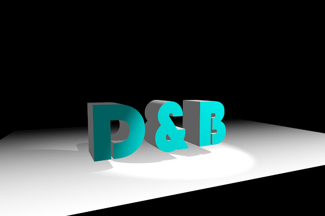
3D Text Effect Imgae
Today we leaned how to create a 3D text image in photoshop. I started off by creating a new document with a black background and then duplicated it and then put a gradient from black to white on this new layer. I then made a new layer with the word D&B on it. I then add edited it in the repousse part of photoshop and added and excrusion to it to make the ext 3D. I then converted the text layer and the gradient layer into a 3D postcard and merged them together using the 3D merge option. After this I used several tools within the 3D menu to make the gradient face upwards from the floor, the text sit on top of that gradient and finally place a light in the corner shining down on the text which gave a shadow on the floor as well. I then opened the text layer in a new tab in photoshop and changed the colour to a light blue which changed the colour of my original image as well.


Wednesday, 2 February 2011
LINKS
Stage 1: Investigating past and current practice in capture
http://jwrightson2capture.blogspot.com/2011/01/past-current-practice-in-capture.html
Stage 2: Planning your capture
Stage 3:Exploringandexperimenting
http://jwrightson2capture.blogspot.com/2010/10/typography-image.html
http://jwrightson2capture.blogspot.com/2011/02/3d-typography.html
http://jwrightson2capture.blogspot.com/2011/02/3d-piano-smashed-glass.html
http://jwrightson2capture.blogspot.com/2011/02/3d-text-effect-imgae.html
http://jwrightson2capture.blogspot.com/2011/02/3d-typography.html
http://jwrightson2capture.blogspot.com/2011/02/3d-piano-smashed-glass.html
http://jwrightson2capture.blogspot.com/2011/02/3d-text-effect-imgae.html
Stage 4: Completing your capture work
http://jwrightson2capture.blogspot.com/2011/02/creating-my-website.html
http://jwrightson2capture.blogspot.com/2011/02/web-plan.html
http://jwrightson2capture.blogspot.com/2011/02/my-completed-website.html
http://jwrightson2capture.blogspot.com/2011/02/creating-my-website.html
http://jwrightson2capture.blogspot.com/2011/02/web-plan.html
http://jwrightson2capture.blogspot.com/2011/02/my-completed-website.html
Subscribe to:
Posts (Atom)


