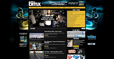
The first website I looked at was rideukbmx.com. the majority of it was a simple type face but the logo for the website had a bold type face. it also had a fairly simple layout. On the back ground it was advertising a new game coming out on PS3 and Xbox and it used light colours on a dark background which made it stand out. because it was a bmx website it had a lot of links, videos and images of bmxing.
I then had a look at another bmx based website. This website was completely based upon their own company called Kink. The layout of the website was very plain as it had a white patterened background which ontop had a white box containing lots of images and videos of their bmx team. It also had a navigation bar at the top was black and white tabs and had a white logo aswell.
After that i had a look at a website which sell bmx's, bmx components, and bmx clothing. this website was called winstanleysbmx.com. This website was also a simple layout website. i had a white background whit a red navigation bar at the left hand side of the screen. the logo was black and red and part of the came off of the logo and carried across the whole web page which made it look like part of the web page, not the logo. Also on the right hand side it had bmx brand links to take you to their latest bmx selection.
 The first website I looked at was rideukbmx.com. the majority of it was a simple type face but the logo for the website had a bold type face. it also had a fairly simple layout. On the back ground it was advertising a new game coming out on PS3 and Xbox and it used light colours on a dark background which made it stand out. because it was a bmx website it had a lot of links, videos and images of bmxing.

Thanks for your post. We will also come back to your blog to enjoy wonderful posts. Good luck from GrafWeb.
ReplyDelete