Wednesday, 17 November 2010
DSLR Induction
This morning we had to have a DSLR induction which involved learning how to hold the camera, taking the lens of of the camera, how to turn it on and off and how to use the basics of th DSLR. Once we knew how to set it up we had to learn about how to set it to diffent shutter speeds, focusing, when we would use a tripod and about the F points. having the F points set to a different setting will change the blur in the background or foreground.
Wednesday, 10 November 2010
Logo
I made my logo mainly in illustrator and a bit in photoshop. I started off by opening a new A4 sized document in illustrator. I then used the text tool and typed my logo name 'FreeRideBMX' three times. I arranged them so they were on top of each other. I the change the top ones font to wingdings 2 and the bottom one to wingdings 3. I left the middle one as a readable font. I then made the top and the bottom text white and the middle ext a light blue.
I the took this image into photoshop and as a background for my logo i used the gradient tool and chose a colourful pre set. I then clicked and dragged a little bit in the bottom right of my logo to make the effect i have. I then went onto the layer with my logo on and applied a drop shadow by using the blending options
.
Tuesday, 9 November 2010
Square apple
To start with i opened up a picture of an apple. I Then, on a new layer, used the brush tool to draw green lines to make the outline of a cube over the apple. I used the shift button to help draw straight lines. Once i had my cube outline on top of my apple i went to liquify it. In liquify i used the freeze mask tool and filled in the cube shape. I then used the forward warp tool to bring any parts of the apple which were outside of the cube, inside the cube. I then exited liquify mode and used the brush tool again to draw the inside lines of the cube again but in white. With these white lines i turned the opacity down and added a gussain blur to make it lok like a shine on the edges of the square apple. After this i opened a new picture of a sliced apple. I then used the magic wand tool to get rid of the background then copyed it. I then , on my square apple, used the lasso tool and went around the edge of one side of the apple.i then special pasted my sliced apple into this area of the square apple. I then adjusted it in free transforn to make it look more reallistic and finally used the burn tool around the edegs of the sliced apple.
Pool Ball
I made this ball in photoshop. I started off by using the gradient tool to make my background. After this i used the elip[tical marquee tool to create the outline of my snooker ball. i then filled it with an orange colour. After this i used the dodge and burn tools to make the ball have a slight shade and to make it have a lighting effect on it.After this made a shadow underneath also by using the eliptical marquee tool and filled this with black, i then added the gussian blur to it.
Tuesday, 2 November 2010
Ride To Glory Poster
I made this poster in Photoshop. I started by getting a picture of a BMX photo. Then i went on to use the magnetic lasso tool and polygonal tool to go around different parts of the image, such as the sky, hills in the background, foreground and the big bush. Once i chose one of these i added a filter to it. I did this for each part of the picture. I then got a logo for the film off of the internet and got rid of any unwanted background. i the placed it onto my poster and used the polygonal lasso tool to make triangles over the title then move that area within the triange. I done this to give the title a shattered effect. I the Put my own 2010 symbol underneath the title by using the text tool. Also using the text tool i made the '5 teams go head 2 head for the title' and changed the colour of the top line to make it stand out. I then made the 'its on!' text by using the same method but i added a drop shadow and an inner shadow to make it really stand out.
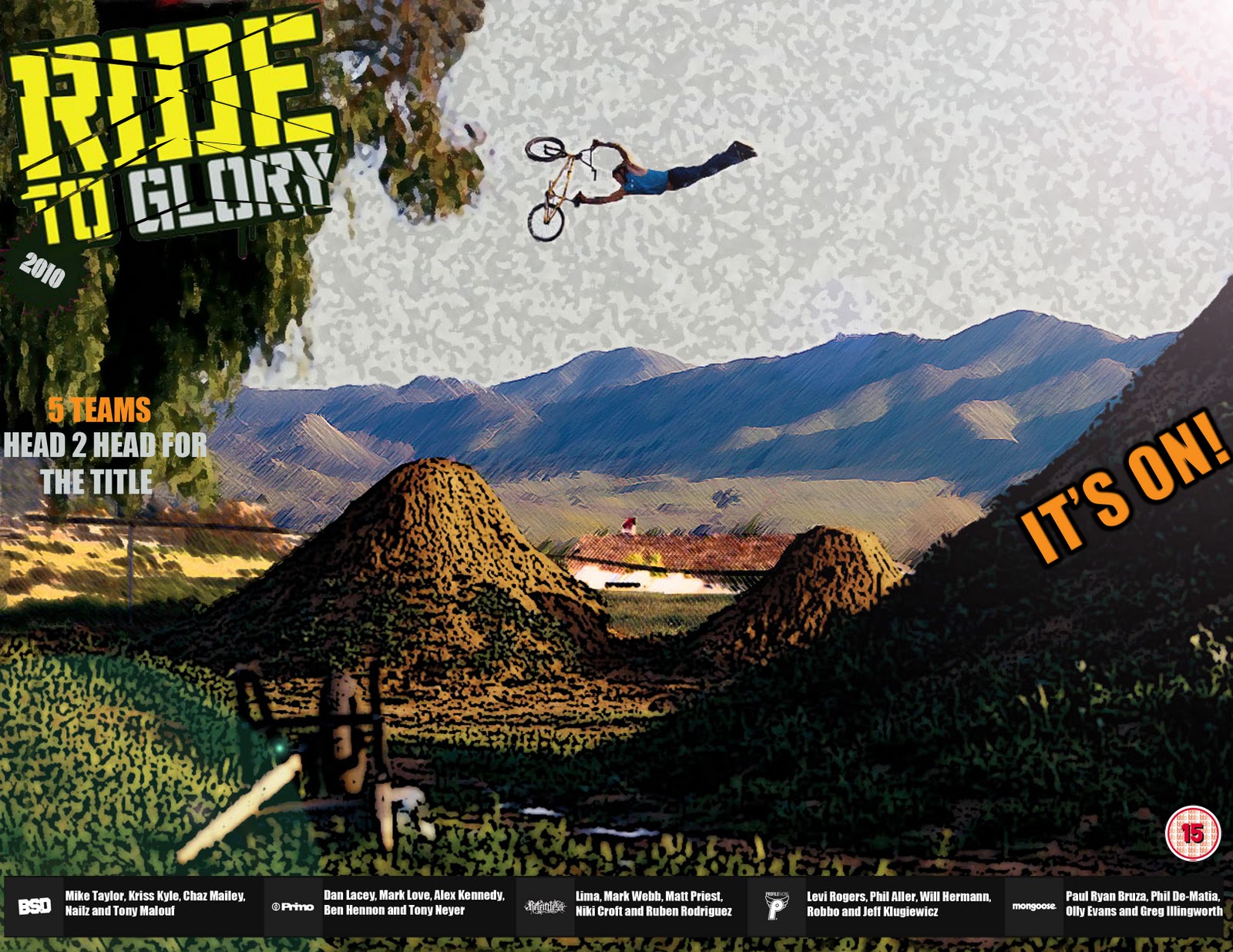
After this i got pictures of the BMX teams logos and placed them at the bottom followed by each team members names.After this i placed a 15 certificate into the poster to make it look a little more realistic.
Photoshop tutorial
In this demo i sterted off by opening a picture of a boy and a picture of a beach . I then used the quick selection tool to select the most of the boy that i could. I then clicked refin edge and put the view mode to black and white and then the output to new layer.
Shatter Text
i created this image in Photoshop. I started by making a black backround with a hieght of 4 inches and a width of 8 inches. I then created a new layer and used the text tool to type my name. With this i changed the size of the text and the font as well. I then edited this text by using the bevel and emboss effect. This gave a silver chrome look once i had finished playing around with these settings. I then selected the polygonal lasso tool and made several triangle shapes over the text and moved each triangle away slightly to create a shattered effect on the text.
After the text was done i created a new layer, whiched was placed inbetween the text layer and the background, and used the lasso tool to create a circular shape. I then put a cloud effect on this and then added a radial blur to make it look like an explosion. Once that was made i created a new layer which was a explosion for the text. I then moved this explosion slighly to the left and merged this layer to the main explosion layer. Then with the explosion and text explosion layer i chose the hue/saturation tool and adjusted the settings to make the explosion green. Once i had made the explosion i created a little shadow behind the text by using the stroke and drop shadow options on the text layer. I then moved this shadow and turned the opacity down aas well.
Subscribe to:
Posts (Atom)