I created this poster in Photoshop. I stated off with a picture of a police car and several picture of graffiti in Astor park. My idea was to put the pieces of graffiti onto the police car. I started off by opening several images that i took of graffiti and then cropping them until i had the piece of graffiti that i wanted. I then used a layer mask on each one so i could get rid of any unwanted background. Once i had carefully made these pieces of graffiti to the way i wanted i moved them onto the picture of the police car. With the police car as my background I Put these other images of graffiti on top of the car. Once that was done i moved them into place to cover up as much of the police car as i could except the windows, lights and wheels. Because some of the images of graffiti had parts which were covering the wheels or a bit of it was on the window, I used a layer mask and selected the brush tool on the specific image to got rid of any parts covering parts of the car i didn't want it to. I then had an idea of being able to see the outline of the door and the petrol cap on the car so it would look more realistic. With this idea in mind i again used the layer mask and the brush tool to make a thin line on each layer of graffiti, each the size of the door crack and did the same around the petrol cap. I didn't get any of these images of graffiti off of the internet as you can see that some pieces of graffiti on the car are also in the background on the wall which is where I took these pictures.
Wednesday, 20 October 2010
3D text & Lighting
I made this in Max. I started off by using the text shape tool and clicked the centre of the canvas. I then typed the letter C and extruded it to make it 3D. After this i rotated from it laying down to an upright position. i then chose an easily readable font for the letter and changed the size to make it bigger. After that i cloned it as a copy so i can edit it. With this clone i changed into a letter A and then made it a bit smaller and moved it back and left a bit to make it look like that it is behind the first letter. I did this to all of the other letters, cloning it as a copy and then making it smaller and moving it back and left. Once i had spelt the word capture, I went into the material editor in the rendering drop down menu and chose compact material editor. With this i can make a pattern of a texture and place onto a letter. The first texture pattern i made was a blue and black smoke looking pattern. With this i dragged it over the letter C. I then made a green and black smoke pattern and dragged over the letter after. Once i had done that i dragged the blue and black over the letter P. I kept doing this until i had a pattern so every other letter was a different colour. The image above was my final outcome and i am pleased with it is a very bold model and that was what i was aiming to create.
Tuesday, 19 October 2010
Monday, 18 October 2010
T-Shirts
To start with I opened a picture of a t shirt in Photoshop. I then opened 2 more pictures, one of the 'no!' graffiti and one of the eye with wings. With these 2 pictures i put a layer mask on them and got rid of any unwanted background and then placed onto my t shirt. I the changed the hue/saturation of the t shirt image to make it a blackish colour.
In this picture I done the same process as i did in the previous image but used a 3D graffiti picture. Also instead of using a layer mask I used the the polygonal lasso tool and carefully went around the outside and inside of my image and deleted the background until I was left with just the 3D graffiti. I then placed this image on top of the t shirt and then edited it by rotating it and making it bigger. I then added the graffiti eye which i had already edited onto it as well.
With this t shirt I got 3 images of graffiti stencils and opened them up in Photoshop. I the got rid of all of the white on each image by using the magic wand tool. Once it was just a black stencil I placed them onto my t shirt image and turned the fill down a bit on all of them to make them blend in with the t shirt a bit more.
Wednesday, 13 October 2010
Cola Bottle Design
I made this image based upon me. To start with I took a picture of my bottle of coke by using the web cam on the computer. I then opened that image up in Photoshop and added a layer mask to it. With this layer mask I used the brush tool to get rid of the background. Once the background was gone I changed the whole picture of the bottle into black and white. I then Opened a new document A3 size ant used the rectangle tool and made it the size of the page and then I made the rectangle black. After that I made another rectangle the same size but white this time and rotated slightly to the left. I then done this process a few more times but made them go black then whit etc.. After this I put my image of my bottle into the centre of this black and white background image that I made. After this I got rid of the cola brand name by using the clone tool. I then created my name in the coca cola font and made it white. I then adjusted it to fit in the picture where the brand name originally was. Once that was in place I used the text tool to make the E.S.T 1994 part of my bottle. I made it white and put it on the bottle under my name. I then opened a new picture of a BMX and got rid of the back ground by using the magic wand tool and then on my bottle image I used the clone stamp tool to get rid off some text which was inside a bordered box. I then placed the image of the BMX into it as I like BMXing. After doing all of this I selected the magnetic lasso tool and went around the outline of the coke bottle and right clicked and selected make work path. After this I chose the text tool and typed my date of birth. I then copied and pasted my birth date all the way around my bottle.
Tuesday, 12 October 2010
Forms Of Graffiti
Stencils:
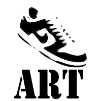 Graffiti stencils are normally made out of paper, cardboard, or other easy to use materials to create an image or text that is easily reproducible. Once the stencil is made then the desired design is cut out of the selected medium and then the image is transferred to a surface, such as a wall, through the use of spray paint or roll-on paint.
 3D Text:
3D text is form of graffiti which stands out a lot more or looks more realistic. Some artist use this effect to make their work, such as a well known graffiti artist called Daim. Daim is a German graffiti artist who first started spraying in 1989 and hasn’t stopped since. Daim has become one of the most sought-after graffiti artists in the world, and has even appeared in the Guinness Book of World Records for spraying the highest graffiti in the world. The only ‘traditional’ graffiti artist on our list, Daim creates 3D art on interior and exterior walls, canvas and vehicles and also works in animation and sculpture.
Monday, 11 October 2010
EXIT Through The Gift Shop
After watching the first half of Exit Through The Gift Shop i think that street art is a good way to express an artists feelings or their passion. Also Banksy is a specific individual as his identity is kept as a secret which makes people think more about who he is and why he has done this. The best piece of art that i have seen so far that i like is the one with the phone box that has been cut diagonally in half and put back together a different way which also has an axe stuck through it with red paint dripping down as if it were bleeding. He placed this piece of art in a public walk way once he had finished. I like it because it is different and makes you think why has he done this.
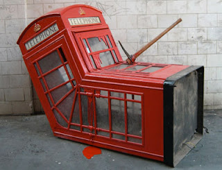
After watching the whole of the film I realised that this French person, who named himself 'Mr.Brainwash', who started off small, selling clothes in a shop for much more than their worth, then started going around helping street artists whilst constantly filming it all, basically frauded his way to the top in L.A and became a big success who basically copied other artists work. None of his own work was really self inspired and new to the world of street art.
Typography Image
With this image I took a picture of myself and opened it up in Photoshop. I the put a dry brush effect on to it and edited the options with it to make it a simple looking image. After this I used the magic wand tool to select a certain area. On a new layer with this area selected I right clicked and chose 'make work path' to make this area selected have a black line as the outline. With this I chose the text tool and start typing the word sleep around the outline. I done the same process with several parts of the picture until my face had been outlined by the word sleep.
Wednesday, 6 October 2010
typography
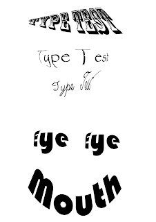 I created these text images in photoshop by using mainly the text tool.
 With this picture on the right I used the text tool to type my word and then changed each text by changing the font, font size and also using the warp tool which gave me options to warp the text into a shape such as fish eye, arc, arch and squeeze.
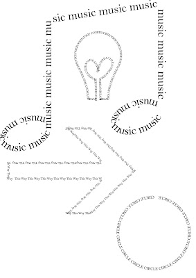
After learning this stage of typography I then went on to putting text around a particular shape or symbol. I done this by selecting the custom shape tool and then selecting a shape and making it on the canvas. After this I chose the text tool and clicked on the line of the shape and started to type my text. I did this all the way around the shape. After that I experimented with other shapes.
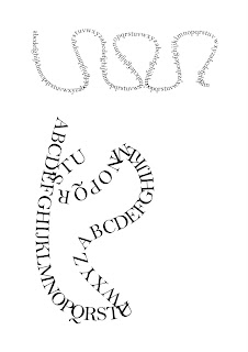
With this image on the right I selected the pen tool and then chose the paths option so I could create my own path. After creating my path I used the text tool and placed the alphabet around the curvy path that I created. As i typed the alphabet it followed the path.
typography testing
I created these text images in photoshop by using the text tool. I then changed each text by changing the font, font size and also using the warp tool which gave me options to warp the text into a shape such as fish eye, arc, arch and squeeze.
David Carson
David Carson is an American graphic designer. He is best known for his innovative magazine design, and use of experimental typography. He was the art director for the magazine Ray Gun. Carson was perhaps the most influential graphic designer of the nineties. In particular, his widely-imitated aesthetic defined the so-called "grunge typography" era. He then went on to be the the art director of Transworld Skateboarding magazine. In 2000, David Carson opened a new personal studio in South Carolina. In 2004, he then became the Creative Director of Gibbes Museum of Art in Charleston and designed the special Exploration edition of Surfing Magazine and directed a television commercial for UMPQUA Bank in Washington. I like David Carson work because in his pictures there's always one part of it that stands out.

Tuesday, 5 October 2010
Photography Investigation
Photography is the process, activity and art of creating still or moving pictures by recording radiation on a radiation-sensitive medium, such as a photographic film, or an electronic sensor. Photography uses foremost radiation in the UV, visible and near-IR spectrum. For common purposes the term light is used instead of radiation. Light reflected or emitted from objects form a real image on a light sensitive area or a FPA pixel array sensor by means of a pin hole or lens in a device known as a camera during a timed exposure. The result on film or plate is a latent image, subsequently developed into a visual image. An image on paper base is known as a print.
Methods of capture
These are methods of capture which i thought of. I will be choosing three of these in which i will be using. The first method of capture i will be using is photography. I will be using photography as it is a simple method but i will try to make the images really effective.
The second method of capture that i thought i will use is drawings. I chose this because a particular method of drawing is graffiti and this type of drawing can express feelings and emotion in a piece of art. I could attempt to draw my own graffiti picture and the edit it if needed to improve it.
The third method of capture i will be using will be markings. I chose to use markings as it is used to tell a story or sometimes can be used to mark territory. I thought this would be a good method to use as i could try to find out the story behind it or why someone has marked their territory.
Subscribe to:
Comments (Atom)


